
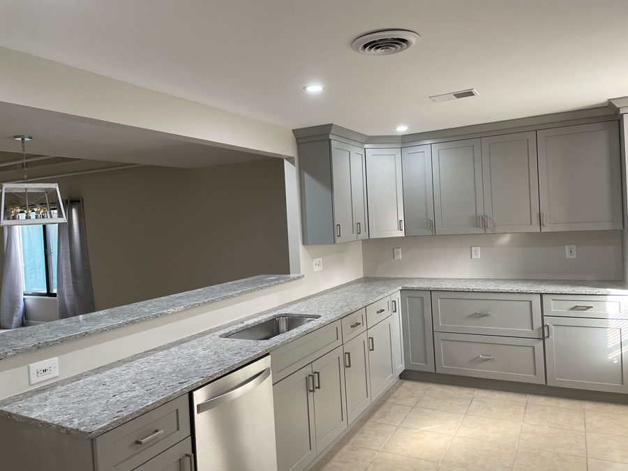
Interior Colors That Work Best in Connecticut Shoreline Homes (And Why Coastal Light Changes Everything)
Five color families consistently work well in Connecticut shoreline homes: warm coastal whites, misty blues and ocean grays, soft earthy greens, warm neutrals like greige and taupe, and deep charcoal accents. But the reason these particular families succeed near the water isn’t just style, it’s physics. Coastal light is stronger, more reflective off open water, and carries more UV intensity than inland light, which means colors that read one way in a showroom or an inland home can shift noticeably once they’re on a wall facing Long Island Sound. This guide breaks down where each color family works best and why coastal light changes how you should test and choose color in the first place.
Why Does Coastal Light Change How Paint Colors Actually Look?
Light reflecting off open water bounces additional brightness and a cooler cast into a room compared to the same light traveling over land. Connecticut’s shoreline light also shifts more dramatically across a single day than inland light does, warm and golden in the morning, then softer and more silvery by evening as it reflects differently off the Sound. A color that looks warm and balanced in a paint store, or in an inland home for that matter, can read cooler, brighter, or more washed out once it’s on a wall that gets several hours of direct coastal sun or bounced light off water.
This is why a small paint chip is especially unreliable near the shoreline, the swing between morning and evening light here is wider than what most inland test methods account for. Painting a larger sample directly on the actual wall and observing it at multiple times of day gives a far more reliable read than a chip alone, and it matters more here than it would a few miles inland.
What Are the Top Interior Color Families for Shoreline Homes Right Now?
| Color Family | Look & Feel | Best Used In |
|---|---|---|
| Warm Coastal Whites (creamy ivory, sand white, linen) | Airy, larger-feeling, reflects natural light; pairs with brushed nickel, natural wood, woven textures | Living rooms, kitchens, hallways |
| Misty Blues & Ocean Grays | Calm, classic New England feel; blue-grays balance warm wood tones and cool coastal light | Bedrooms, bathrooms, relaxation spaces |
| Soft Earthy Greens (sage, eucalyptus, pale olive) | Grounded, nature-connected; complements homes near trees or gardens | Kitchens, mudrooms, home offices |
| Warm Neutrals (greige, taupe, warm beige) | Softer than cool industrial grays; lets furniture and architectural details stand out | Main living areas, open-concept spaces |
| Deep Charcoal Accents | Adds contrast and definition without overwhelming a room | Interior doors, built-ins, wainscoting, dining rooms, powder rooms |
Why Do Warm Coastal Whites Work So Well Under Coastal Light?
Warm whites, creamy ivory, sand white, and linen tones — echo driftwood and sun-bleached shells rather than a stark, cool white, and that warmth helps offset the cooler cast that reflected water light can bring into a room. They make spaces feel larger and more open, especially where natural light flows through the room, and pair well with brushed nickel fixtures, natural wood floors, and woven textures. A cooler, starker white can end up looking almost clinical once coastal light hits it directly, the warmer undertone is what keeps these whites feeling soft rather than harsh.
When Should You Choose Misty Blues or Ocean Grays Instead?
Blue-grays and soft blues draw directly from the sea and sky, and pairing misty blue walls with crisp white trim creates a classic New England look. Grays with blue undertones lean more understated but still bring that coastal calm. Because these tones already sit close to the cool end of the color wheel, they tend to hold up consistently well across the day’s changing coastal light rather than shifting dramatically from morning to evening, making them a reliable choice for bedrooms, bathrooms, or any room meant to feel calm and restful.
Are Earthy Greens a Good Fit Given How Coastal Light Behaves?
Yes, particularly for homes surrounded by trees or gardens, where the softer, filtered light differs from a room facing open water directly. Sage, eucalyptus, and pale olive tones bring a grounded, nature-connected feel that reflects the landscape around the house rather than fighting it. These greens tend to work especially well in kitchens, mudrooms, or home offices — spaces where a fresh, focused feel matters, and where light exposure is often more moderate than a water-facing living room.
Why Are Homeowners Moving Toward Warmer Neutrals Instead of Cool Gray?
Cooler, more industrial grays can turn flat or slightly cold once reflected coastal light hits them, which is part of why warmer neutrals — greige, taupe, and warm beige have been gaining ground in shoreline homes. These warmer tones add depth and comfort while letting art, furniture, and architectural details stand out rather than competing with the wall color, and they tend to hold their warmth more consistently across the day’s shifting coastal light than a cooler gray would.
What’s the Purpose of Deep Charcoal Accents in an Otherwise Light Palette?
Charcoal and muted black accents provide contrast in a home that’s otherwise light and airy. Used on interior doors, built-ins, or wainscoting, they add visual definition and a high-end, designer feel without overwhelming a space, especially when paired with white walls or soft neutral backdrops. Because charcoal sits at the darkest end of the palette, it’s less affected by shifting coastal light than a mid-tone color would be, which is part of why it holds its intended look consistently as an accent rather than a full-room color.
How Should You Test and Choose Color for Your Specific Shoreline Home?
The right palette responds to your home’s architecture, its lighting throughout the day, and the season. Because Connecticut’s shoreline light shifts more than inland light does, the most reliable approach is to paint a larger sample directly on the actual wall — not just a chip and view it at multiple times of day, including whenever the room gets its strongest direct or reflected light. A color that looks perfect at 10am facing the water may read entirely differently by 6pm.
If you’re weighing color options for your own shoreline home, the Simons Painting & Drywall team can help match a palette to your home’s architecture, lighting, and surroundings.
Learn more on our Interior Painting page and if you’re refreshing a kitchen or bathroom’s color story, our Cabinet & Vanity Refinishing service pairs cabinet color updates with a full room refresh.
Frequently Asked Questions About Interior Color Trends on the Connecticut Shoreline
Why do paint colors look different in my shoreline home than they did in the store?
Light reflecting off open water adds extra brightness and a cooler cast compared to inland light, and Connecticut’s coastal light shifts more dramatically between morning and evening than inland light does. A color that looked accurate on a small chip under store lighting can read cooler, warmer, or more washed out once it’s on a wall exposed to that shifting coastal light.
What interior paint colors work best for a Connecticut shoreline home?
Warm coastal whites, misty blues, soft earthy greens, warm neutrals like greige and taupe, and deep charcoal accents are all popular choices that complement the region’s natural light and classic New England architecture. The best choice depends on the specific room, its lighting exposure, and the mood you want, rather than one universal answer.
What color makes a small coastal home feel bigger and brighter?
Warm coastal whites, like creamy ivory or sand white, tend to make spaces feel larger and airier because they reflect natural light well without turning cold or clinical under strong coastal light. Pairing them with natural wood and fixtures like brushed nickel reinforces that open, coastal feel.
How do I test a paint color before committing to a whole room in a shoreline home?
Paint a larger sample directly on the wall rather than relying on a small chip, and view it at multiple times of day, since coastal light shifts more dramatically here than inland from warm and golden in the morning to cooler and more silvery by evening. A color that looks right in one type of light may look noticeably different a few hours later in a room with direct or reflected water light.

Shea Simons is the owner of Simons Painting & Drywall, a family-owned painting and refinishing company serving Connecticut Shoreline communities from East Lyme and Niantic to Old Saybrook, Madison, and Mystic. Shea and his team specialize in interior and exterior painting, drywall repair and installation, and fine refinishing work for cabinets, furniture, and custom walls. Homeowners along the shoreline know Shea’s crew for meticulous prep work and a finish built to hold up against coastal salt air and humidity.